1.
I believe that my snake project was the most successful. The most time was also spent on it. This is "Snake from a Mouse's View" and the theme was "Look at that View!". The media were pencils and colored pencils.
It started out more like this, with the contrast between lines more obvious. However, the scales had to be erased at least 3 times. All of them. It was hard to get a hang of them at first.
This picture had the scales I finally decided on. Much better than the previous picture, they're more in order and the balance of them is really good.
At this point, I hadn't started on the background yet, but the contrast between every scale is clearly shown and each one made shading a tedious task. The color (green) of the back makes the red eyes stand out, so it was a good decision to choose green paper to draw on. I don't think anyone else chose to do color. The pencils used were very good - but maybe not that really dark one, it was too scratchy - and the colored pencils made the snake "Pop!".
2.

This was probably the least successful project. My "Full Body Sketch" is in the middle, and the media I used was charcoal. We were drawing each other, and it had to be the other person's full body. It feels bad because the proportions are all wrong, the shading on the jeans is bad, and the wrinkles don't really follow the actual clothes. From her head to her feet, it slowly gets smaller - almost as if she was a skyscraper and we were looking down on her. Such a strange perspective. When I drew Hannah (Subject No. 1), I didn't consider drawing the eight-heads thing or checking out how the proportions were supposed to go. That's not my style. I had to crawl all over my drawing as I drew it; that definitely made it a little bit worse. Next time I'd use the right proportions, be not sick, hang the paper on the wall, and do the shading and creases correctly. That would make drawing this sort of thing easier because: 1. The proportions would be correct. 2. I wouldn't be coughing and sneezing all over the place. 3. I wouldn't be crawling all over it and smudging everything. 3. Clothes would be better.
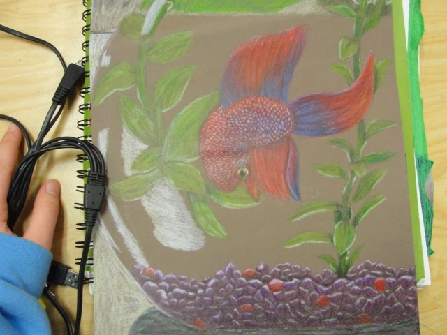
3.
The first picture was my drawing of Keith Haring (Ms. Sudkamp's pet fish. He's awesome.) and the second picture is my scratchboard drawing of a sand dragon.
The contrast and flow in this drawing is great, though the body could have used more work. A fish doesn't bend that way. The scales are a little uneven - though that was the point. This project was "Keith Haring" and the theme, "All the Things you can See Through". The media was colored pencils. I chose him because I really liked Ms. Sudkamp's fish and because, well, he's in a glass bowl that you can see through. Most of my references were Betta fish (that's what Keith is) or Siamese Fighting fish, but I had a few references of Keith, too. After all, he was the main subject.
Every single scale and rock had to be drawn, shaded, and the contrast needed to be checked. Highlights were necessary on most of the rocks. It was fun, but it sucked a bunch of time for the rest of the project down the drain.
Blending the colors on Keith's body and in the rocks was fun. This picture is, possibly, cooler than the others because it almost looks like the blue parts are glowing. That was because of the white on the rocks - the highlights were great! - and the brown background. It really works.
Drawing the reflections of the plant on the water was somewhat challenging, but I did it. More highlighting and coloring.
And then the final product! I love how he seems more colorful than everything else but at the same time, he matches the pebbles. This project helped me learn how to draw things through a see-through material, and it taught me a little bit of how to draw reflections.
This piece is "Sand Dragon" and the theme was Texture and Movement. The media used was a scratching tool. I feel like the movement and the proportions are better in this than they were in the drawing of Keith. I've definitely improved on shading and the control of my pencil/tool. This project was really fun, and it taught me that on wings, you should follow the contour of them instead of trying to make them more "leathery".
4.
These are the two mini lessons that really helped. The mini lesson (first picture) where we drew candies helped me grow in the category of drawing see-through things. It was really hard to do, since you have to get all the reflections, creases, and highlights in the somewhat transparent material. I do feel like I need to work more on see-through things. It was never a good subject for me. The second picture was practice for our self portraits. This one didn't look too good because we were using a skull to trace over, and that skull did not match ours at all. It was fantastic practice for shading and doing the contours of the face. This lesson definitely had enough practice. This is the final self-portrait.

Sorry that it's sideways, but even so, you can see that the proportions are better, that there's more contrast, and that it actually looks a little like a human. The see-through mini lesson could have used a little more instruction (I hate drawing translucent things), but the self-portrait needed no more.
5.

The scratchboard was probably my favorite medium to work with. It's not the same as having a pencil or a pen, which you press down on to make darker, it's somewhat easier. This medium is enjoyable to me because I like scratching the board and making a unique drawing. On scratchboards, it's easier to get the texture and flow in because (unlike with pencils) you're actually scratching into the surface. When you run your finger over it, you can feel the pattern and movement with your finger pad and it's unique. The black background adds to the art; not by negative space, more like by reversing the shading. It's a little hard to explain, but this material is definitely really cool. With the scratching tool, there are multiple angles you can hold it at to get different effects. It's a good tool to master in that way, since you can get different kinds of marks all over the place. Smooth lines, thick lines, scratchy ones - whatever you want. This style of work is refreshing in the way that it's not like the others. You usually don't get to put a knife to paper, anyways. Plus there can be interesting, realistic, and unique pieces done on this material.


No comments:
Post a Comment