Showing posts with label visual art 2. Show all posts

Sunday, January 12, 2014

Book Art


I chose the theme nightmares and went with that.  Lots of people are afraid of snakes, and since I'd had recent encounters with snakes, I decided on that.  At first it was supposed to be a snake in a forest with a bush and a tree in the background.  Changed to grass with a tree in the background and a sun in the top right.  Sadly, there wasn't time to paint it or finish the tree, but it's better than I expected.  Having a pristine clear plan was extremely hard for me.  Spent too much time estimating how many pages I should do for each layer.  In the end, I just went with it.  Some of the problems faced were; messing up, time management, and inexperience.  When there was a mistake I just went with it.  Nothing's perfect.  It looks pretty good as is..  The original plan was to do a red snake with bright yellow eyes in a dark forest, then became a snake in a field. Showing it in a new light.  (Again, no paint..)  Getting sick of planning was a problem.  I just threw away the planning guide after a bit.  It couldn't have gone better, even though that was a terrible choice.  This looks great to me.  My first book art piece.  I'm proud of it and I will probably take it into my own hands to finish later.

Wednesday, December 11, 2013

Mixed Media

My mediums for this project were watercolor pencils, tissue paper, photo transfer(tape) and pen.  The theme was Amusement.  I came up with this idea because I find cats playing with toys amusing.  Originally I had planned to put a piece of fabric looking like a cat toy in it's mouth, but that proved too hard to do.  A friend suggested polka dots when I was at a loss for the bacground- "Dots are amusing, right?"  I think the spotted background was the hardest to make.  I had to cut out little circles of tissue paper and then wet them down.  I'm proud of the cat, though it's way unproportional.  Front leg too low, neck too long- that kind of stuff.  I think if I could change something, it would be the cat.  However, I do like the markings.

Tuesday, November 12, 2013

Non-Traditional Portrait

       I chose to do a portrait of my cat, Juneau.  My medium was pine needles (and glue?).  I've had pets all my life, and most of them were cats.  So why not do one of my cats?  They're important to me.  I wanted to do footprints at first, but that would take too long and be too big of a scale.  The idea was rejected.  So I was thinking of materials that were easy to get and that are abundant.  My backyard has a forest.  There are tons of pine needles, and I decided that's what I was gonna do.  No shortage of pine needles here.  It was a good decision to use pine needles for my cat because it emphasizes the fur.  Animals are furry.  Well, some of them.  It was a little hard to break up every pine needle cluster and then glue every little piece down.  Looks like it was worth it, though.  One of the risks was the challenge of time.  Sticking every little piece down one-by-one is time consuming.  I've never made a cat with non-traditional materials before, either.  I think I like my choices.  Pine needles made a good medium, and shows the fur well.  I guess I can connect the materials to my cat.  I want to take him outside eventually, but he's a little eager to go outside and we might not be able to trust him.  Anyways, this project was pretty fun and I liked it.

Wednesday, October 23, 2013

Sticky Situation


  My ideas for Sticky Situation began with thinking of various situations without a good ending one could get into.  For example, having a pencil with no erasor during a test, stepping on a tack, animals stuck in honey- anything like that.  Yes, I was able to think outside the immediate box.  When you hear "sticky", most people think a fluid or something that is adhesive, but this project was trying to get you to focus on a more wide range of options.  Or so I thought.  Who knows.  I put repetition and pattern in the picture by having a striped wallpaper in the background, stairs, and railings.  Repeating, sort of.  It was a little annoying to shade the railings.  I kept messing up on them, and it'll still never be perfect, but I tried.  Using tape to reinforce the lines was a good idea.  I chose paint.  Acrylic paint?  Yeah, I'm just going to call it paint.  I preferred using it as well because I could layer things without the previous layer being too visible- unlike watercolor.  Haha.  I layered a lot and the amount of paint caked onto my canvas is probably an inch wide.  Bet you could crack it off and get a panel of just paint.  (not really).  Mini lessons?  We had those?  Well, my dad told me that holding the paintbrush near the bottom gave you the most control, but I already knew that.  I don't really remember doing any mini lessons.  This project was pretty interesting and fun to do.

Wednesday, October 2, 2013

Up Close and Personal

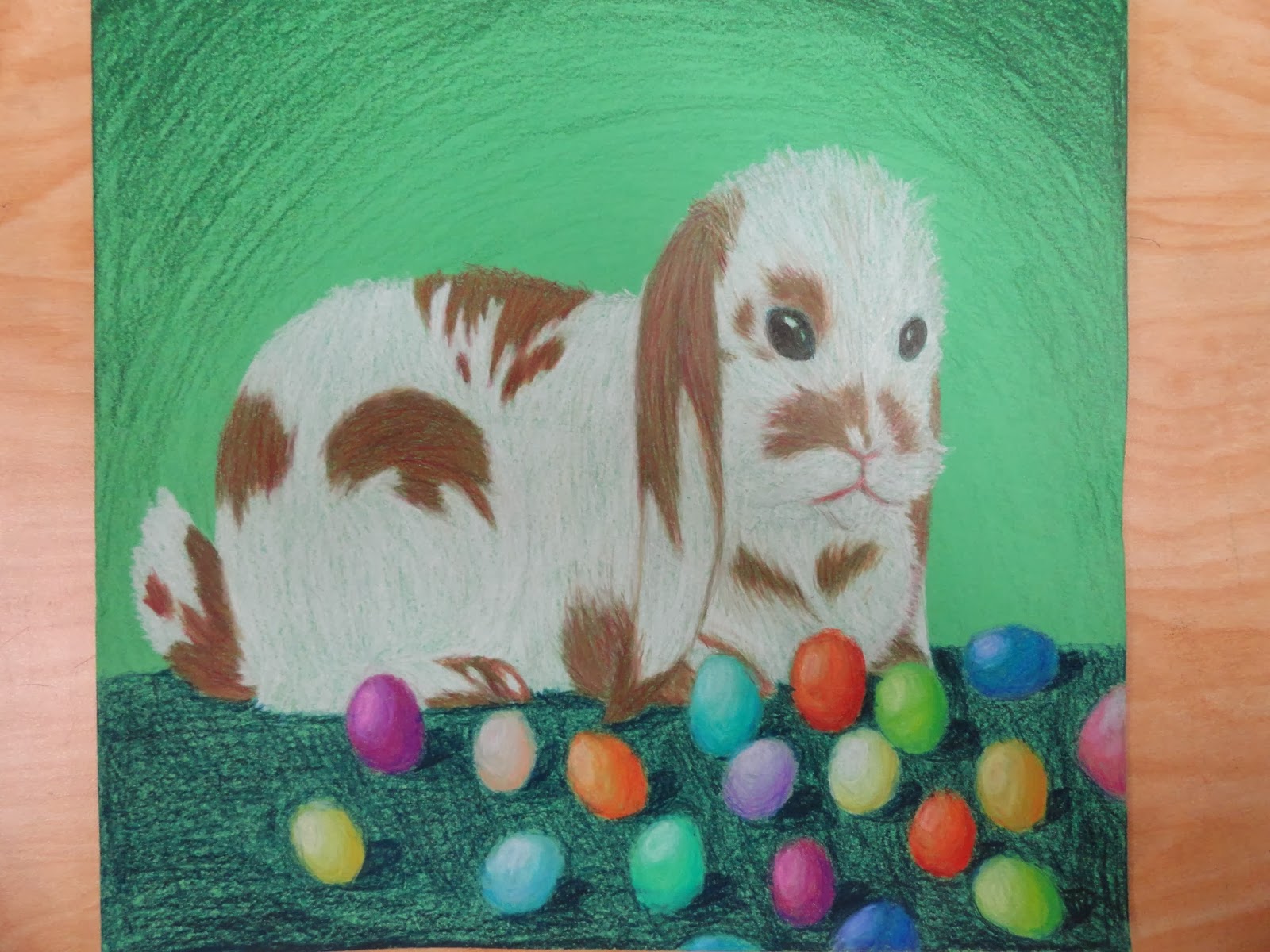
The theme was up close and personal.  My media was/were colored pencils.  Chose a rabbit because there had been lots of rabbits over the past few days and I wanted to see how well I could draw fur.  It was fun.  I emphasized the rabbit.  Maybe the eggs, too.  They all stand out.  Due to their bright colors, of course.  I chose colored pencils over the others because it seemed like a good idea, and the most interesting one.  It did not dissapoint.  Well, "interesting" might not be the key word.  Probably more "familiar" or "good to draw animals with".  The colored pencils enhance my piece by being my piece.  They make it colorful, give it contrast.  The background is uneven.  That's what I get for not wanting to accidently color the bunny's head.  Oops.  Ok, so you encourage risk taking.  That wasn't a question, though.  Yes, I took risks.  Almost messed up the eggs completely.  Thanks to the Primacolors for being able to layer.  Also I have never drawn an animal like this.  I don't mean rabbit.  Well, I haven't drawn a rabbit before like this.  But what I meant was that I haven't drawn an animal in this style before.  It doesn't even have outlines.  The rabbit looks like an alien.  I included technique, concept, and medium.  Who doesn't include medium?  Besides those people who make those blank canvases and sell them for tons of money.  I guess you could also say this is new.  Maybe emotion, too.  Maybe.  Probably not.  It was meant to be an easter bunny, but a normal bunny with eggs is fine too.  And that's pretty much it.

Thursday, September 12, 2013

What's the Point

Most of my solutions to "What's the Point?" were hands, since that's what I naturally think of.  I don't really understand what you mean by solution, though.  It's an abstract question based around drawing, and having a solution for it just confuses me.  This solution is what I chose.  It consists of birds migrating and hands pointing them to where they are going.  The contrast was showed in the feathers, and the hands in the shading.  On the background there is also contrast due to the sudden dark and light colors.  I chose pencil, not pen.  Pencil is much easier to use because you can actually erase it when you make mistakes, as I often do.  Pen was out of the question.  I didn't want to crosshatch or shade in pen, either.  Shading with pencil is simpler and to me, better.  The shade scale is somewhat easier to make in it.  I used tracing, of sorts.  I was looking at my hand when I transferred it from sight to paper.  Contrast is another technique I used, as well as lining.  Outlining.  Whatever that's called.  I didn't take many risks on this, besides actually drawing the feathers on the bird completely.  The body especially looks bad to me, and drawing the feathers on a bird is a foreign thought as I never see a bird with outlined feathers on it's body.  Nor do I do that outline and shading stuff on the wings.  There isn't really some deep meaning to this.  It's literally just birds and hands.  The birds are migrating and the hands are pointing to where they are heading.  The hands are also a pit stop for the birds.  There was supposed to be a meaning?  I didn't really know that.  This just complicates it more.
  I conveyed the migrating thing a little with the birds going in the same direction, and the hands pointing that way.  It isn't really that recognizable, though.  Don't think anyone would know what I meant for it to be if they just looked at it.  Maybe some kind of messed up drawing with hands for trees and birds sitting on the hand-trees and/or flying.